
Vertical Video Guide: Sizes, Safe Zones and Best Practices
Vertical video fails quietly when text sits under a like button. This guide gives you sizes, safe zones, and export habits that keep your message visible.
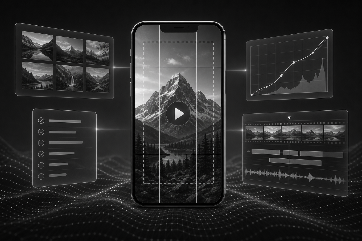
Short answer: Vertical social video usually means 9:16 aspect ratio, often 1080×1920 pixels. Keep important text and product detail in the central safe area so platform UI does not cover it.
Vertical video size and 9:16 dimensions
9:16 is taller than wide, matching phone screens. It is the default language of TikTok, Reels, Stories, and many in-feed video ads. When marketers say "vertical video size," they usually mean width and height in this ratio.
Resolution, frame rate, and file basics
- Delivery size: 1080×1920 is standard; 720×1280 minimum for many placements.
- Frame rate: 24, 25, or 30 fps; match source footage to avoid judder.
- Duration: platform max lengths change; verify docs before export at scale.
- Bitrate: high enough to keep text edges clean after compression.
Platform specs table (starting reference)
Confirm live requirements before major campaigns. Treat this as planning defaults.
| Placement | Ratio | Common pixel size | Planning notes |
|---|---|---|---|
| TikTok organic & ads | 9:16 | 1080×1920 | Right-side icons; bottom caption band |
| Instagram Reels | 9:16 | 1080×1920 | Top handle; bottom UI and CTA buttons |
| YouTube Shorts | 9:16 | 1080×1920 | Title context; subscribe overlay on end |
| Stories (IG/FB) | 9:16 | 1080×1920 | Top and bottom UI heavy; keep CTA mid-frame |
| Vertical in-feed ads | 9:16 or 4:5 | 1080×1920 / 1080×1350 | Check network-specific ad safe zones |
Safe zones: where UI covers your creative
Imagine three horizontal bands on a 9:16 frame:
- Top band: username, music marquee, platform chrome.
- Middle band: primary safe area for faces, products, headlines.
- Bottom band: captions, buttons, swipe prompts.
Keep dollar amounts, promo codes, and legal lines in the middle band with padding. Avoid placing the only product hero detail in a corner that gets cropped in previews.
Text, subtitles, and logos
Use fewer words per line than on desktop. Increase size until readable on a small phone at arm's length. Subtitles should not sit flush against the bottom edge.
CTAs and end cards
Give CTAs at least two seconds on screen. Pair verbal and visual CTA when sound might be off. For paid social, match CTA buttons in the ad manager to what the video promises.
Cropping horizontal video vs designing native vertical
Cropping 16:9 throws away context and often traps faces off-center. Native vertical shoots or reframed timelines with adjusted typography look intentional. Editable layout tools matter because text must move when ratio changes.
Common export mistakes
- Exporting square text positions scaled down into 9:16.
- Ignoring preview crop in grid thumbnails.
- Embedding tiny disclaimer text only readable on desktop.
- Wrong ratio uploaded to ad network, then rejected after review.
Pre-publish checklist
- Correct pixel dimensions and ratio for placement.
- Hook visible in first frame thumbnail.
- Captions inside safe zone.
- Audio levels checked on phone speaker.
- File name matches campaign tracker.
Key takeaways
- 9:16 at 1080×1920 is the default planning size.
- Safe zones are part of creative, not an afterthought.
- Reflow text when changing ratio.
- Verify live platform ad specs before scale.
- Native vertical beats letterboxed horizontal.
Vertical video spec questions, answered
1080 by 1920 pixels at 9:16 is the common delivery size for TikTok, Reels, and Shorts. Some teams capture higher resolution; downscale with care to keep text sharp.
For most campaigns, yes. Verify current ad specs in TikTok's documentation before large spends, because requirements can change.
Middle third, above the bottom UI band and below the top username area. Avoid the very bottom edge.
Shorts expects vertical viewing. Horizontal video letterboxed in Shorts often looks out of place. Reframe or redesign for 9:16.
Top corners with padding, or end card center. Never cover the product hero in the first three seconds.
Move copy upward into the safe area or shorten lines. Re-export; do not rely on platform players to crop kindly.