Animated charts
Animated charts built around turn numbers and trends into a narrative people can follow.

Create data visualization videos for reports, presentations, social content, and stakeholder updates. Turn charts, tables, spreadsheets, key findings, annotations, and brand styling into editable creative with motion, voice, music, and polished exports.
Build practical assets for reports, presentations, social content, and stakeholder updates, then adapt the strongest idea for another audience, message, or placement.
Animated charts built around turn numbers and trends into a narrative people can follow.
KPI summaries built around introduce the question before the chart, reveal data progressively, keep scales and labels honest, and use motion to direct attention rather than distort meaning.
Trend videos built around turn numbers and trends into a narrative people can follow.
Research findings built around introduce the question before the chart, reveal data progressively, keep scales and labels honest, and use motion to direct attention rather than distort meaning.
Comparison visuals built around turn numbers and trends into a narrative people can follow.
Data-led social clips built around introduce the question before the chart, reveal data progressively, keep scales and labels honest, and use motion to direct attention rather than distort meaning.
Use AI assistance for speed, then keep control over the scenes, timing, and message.
Describe the audience, goal, channel, and result you want the creative to communicate.
Upload charts, tables, spreadsheets, key findings, annotations, and brand styling.
Edit the script, layout, typography, motion, voice, music, timing, and scene order.
Create the formats you need, then produce new hooks and variations from the same foundation.
Turn source material into a clear sequence of scenes, then refine the script, visuals, voice, motion, and timing. Keep technical detail where it helps and remove it where a visual can explain the idea faster.
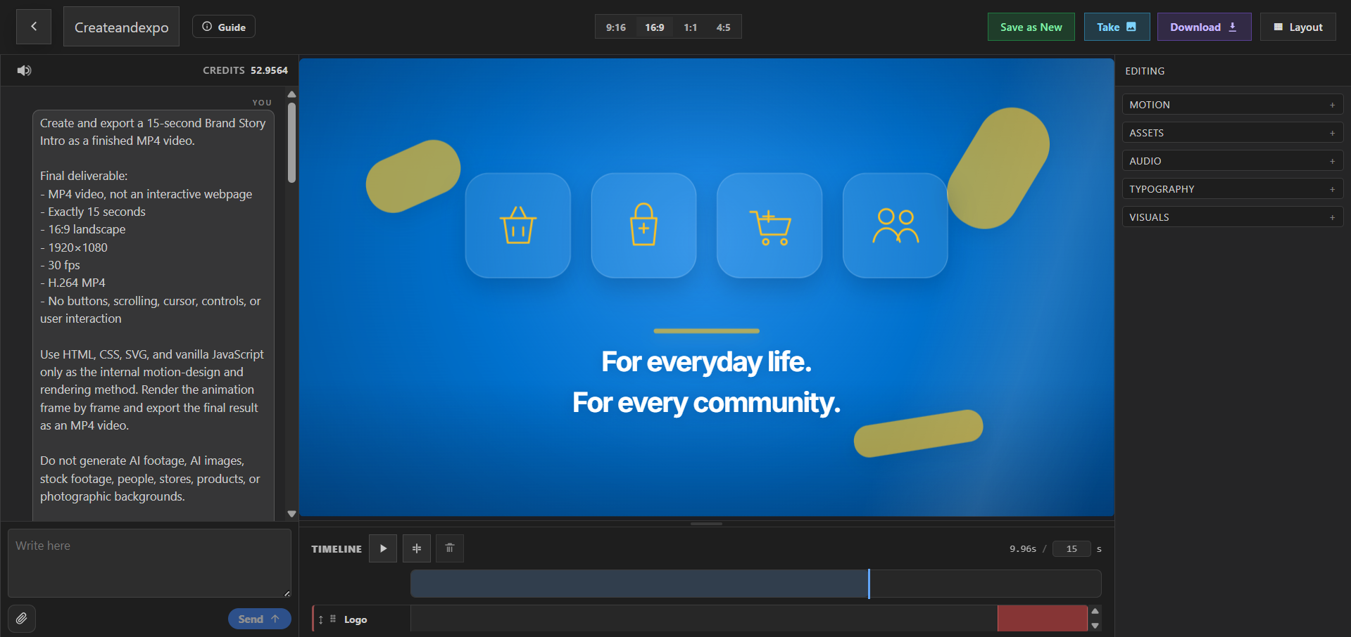
Data Visualization Videos help analysts, researchers, and marketing teams turn numbers and trends into a narrative people can follow. PlayableLab turns a prompt and source assets into a structured first cut that you can refine instead of treating generation as the final step.
Introduce the question before the chart, reveal data progressively, keep scales and labels honest, and use motion to direct attention rather than distort meaning. Return to the Explainer Videos overview to compare this format with the other creative workflows in the category.
Compare adjacent formats and choose the workflow that best matches your audience and distribution plan.
Data Visualization Videos are videos created for reports, presentations, social content, and stakeholder updates. They are most useful when the creative is shaped around the audience, placement, and action you want viewers to take.
You can create Animated charts, KPI summaries, Trend videos, Research findings, Comparison visuals, and data-led social clips. Each concept remains editable so you can adapt the story for a different message or audience.
Introduce the question before the chart, reveal data progressively, keep scales and labels honest, and use motion to direct attention rather than distort meaning.
Yes. Start with charts, tables, spreadsheets, key findings, annotations, and brand styling. You can combine uploaded material with generated visuals, voice, music, typography, and motion while keeping the scenes editable.
Yes. Duplicate the concept, change the opening, message, scene order, visual treatment, or CTA, and preserve the parts that already support the goal: turn numbers and trends into a narrative people can follow.
Export finished explainer videos for websites, education, onboarding, presentations, and social distribution. Check the latest specifications and content policies for the channel or platform where you plan to publish or run the asset.
Start with a prompt or your own assets, refine the creative, and export a finished result.
By continuing, you agree to the Terms of Service and Privacy Policy.
Already have an account?